Posted by Mike Bravo on 22/11/2017
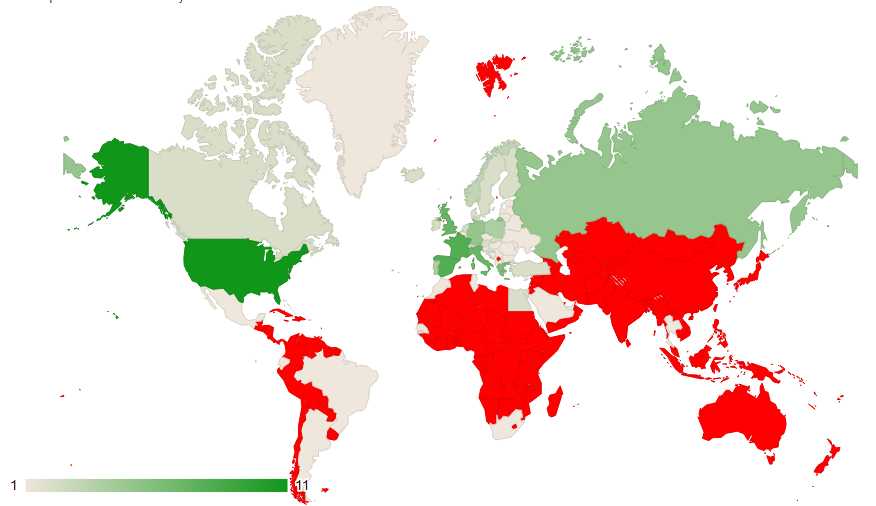
We have two new visualisations available to those who upload their schedules to us
The first is a map where you can see how well your airline covers the globe. It shows you in which countries/continents your airline is strong and in which ones you could expand.Ā
The second is an overview of the schedules by airport and time of day. If your airline requires scheduled flights to be flown at the exact time, you can see which airports have a good coverage and whch ones could do with some extra scheduled flights.Ā
To see these visualisations, go to your profile and click the graph icon next to your VA, then look under the schedules header
Read more